Fix desynced scrollPos caused by scrollbar
Recently I ran into a small, but annoying issue issue while coding a raw data viewer component. The solution I came up with is perhaps a bit unorthodox, some might even call it hacky. Hacky or not, it works in all browsers (even IE8), and is probably less of a hassle than implementing a fix with JavaScript, I thought I'd share it with you.
The problem occurs when you have a table with both vertical and horizontal scrolling, as well as a requirement to keep the table headings fixed to the top.

Lets first do the basic HTML and CSS for our table component
CSS
.table-container {
    position: relative;
    margin-left: auto;
    margin-right: auto;
    width: 60%;
    margin-top: 10%;
    height: 80%;
    max-height: 400px;
    @include clearfix;
    overflow: hidden;
    background: #fff;
    border: 30px solid #fff;
    border-radius: 1px;
    box-shadow: 0px 2px 3px rgba(0,0,0,.05), 0 1px 1px rgba(0,0,0,.25);
}
.table-header {
    position: absolute;
    left: 0;
    right: 0;
    top: 0;
    height: 40px;
    white-space: nowrap;
    overflow-x: auto;
    overflow-y: hidden;
}
.table-heading {
    width: 200px;
    display: inline-block;
    @include text-overflow(); /* for long column names */
}
.table-body {
    position: absolute;
    left: 0;
    right: 0;
    top: 40px;
    bottom: 0px;
    overflow: scroll;
    transform: translate3d(0, 0, 0);

}
.table-row {
    @include clearfix;
    white-space: nowrap;
}

.table-cell {
    display: inline-block;
    height: 20px;
    width: 200px;
    @include text-overflow(); /* for long cell values names */
}
HTML
div.table-container
    div.table-header
        div.table-heading Column 1
        div.table-heading Column ...
        div.table-heading Column ...
        div.table-heading Column ...
        div.table-heading Column n

    div.table-body
        div.table-row
            div.table-cell Cell content
            div.table-cell Cell content
            div.table-cell Cell content
            div.table-cell Cell content
            div.table-cell Cell content
As we can see from the HTML, the table header has to be positioned outside of the table body, to keep it always fixed to the top. This means that there's no direct link between our table body and our table header.
To fix this, we use some simple jQuery to sync the horizontal scroll between the two.
Like so:
$(document).ready(function() {
    $('div.table-body').scroll(function () {
        var currentScroll = $("div.table-body").scrollLeft();
        $('div.table-header').scrollLeft(currentScroll);
    });
});t
Now when the user scrolls the table body, the table header scrolls as well.
The problem
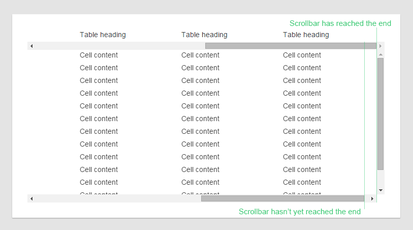
The table body also has a vertical scrollbar, while the header doesn't. The vertical scrollbar takes roughly 20px (depending on browser and OS). This means that our table header is 20px wider than our table body.
When the user scrolls all the way to right, this results in an akward effect. The scrollbar is already at it's right-most position, but the header can still be scrolled 20 more pixels to the right.

The solution
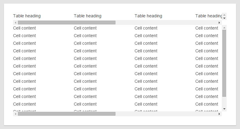
To solve the desync problem in a crossbrowser manner, we can force a vertical scrollbar on the table header as well.
table-header {overflow-y: scroll;}

Now the content area will be exactly the same width cross-browser. However we've ruined the appearance of our beautiful table. Optimally we don't want to show horizontal nor vertical scrollbars in our table header.
To visually hide them we can hide the horizontal scrollbar behind the table body.
.table-header {
        /*new styles*/
        box-sizing: content-box /* you only need this if your reset defines everything as border-box (which it should) /*
        padding-bottom: 20px;
}

.table-body {
        /*new styles*/
        z-index: 1; /* position body on top of header /*
        background: #fff;
}
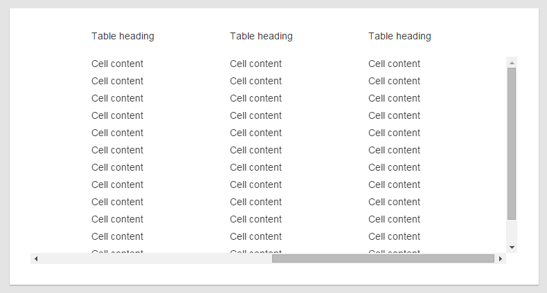
Now we've gotten a rid of our horizontal scrollbar, we can apply the same technique to get a rid of the vertical one. First we offset the header to the right by 20 pixels, so that the scrollbar is no longer visible. Then we add 20 pixels of padding to make up for the offset.
.table-header {
        /*new styles*/
        margin-right: -20px;
        padding-right: 20px;
}

And with this we have achieved our goal of perfectly lining up the table headers and columns in a crossbrowser compatible manner.
